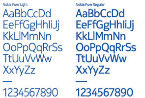
You may recognise Nokia Sans as the font which reads "Nokia - Connecting People" in the Nokia logo. The Nokia Pure typeface has rounder letters, that are supposed to create better legibility on small screen devices. So far the font has just been seen on posters presented by Nokia and will soon become visible on millions of Nokia mobile phones.
Nokia developed the font with London-based typographic designer Bruno Maag, founder and MD of Dalton Maag. "It was a balancing act," admits Bruno Maag on Nokia brand book blog. "An elegantly simple typeface that doesn't draw attention to itself but is still distinctive and different. For me, it's the rhythm of the typeface and the relationship between characters that's critical. After all, when it's set in Arabic, you still need to know that it's Nokia, and this is achieved by creating a recognisable rhythm."
The new font will come in three variants - light, regular and bold.
No comments:
Post a Comment